I used to force Flexbox to do everything. Need a two-dimensional layout? Flexbox with some creative nesting. Want a sidebar and main content? More Flexbox. Looking back, I was making my life much harder than it needed to be.
The truth is, both CSS Grid and Flexbox are powerful layout tools, but they excel at different things. Understanding when to use each will transform how you write CSS and make your layouts cleaner, more maintainable, and easier to reason about.
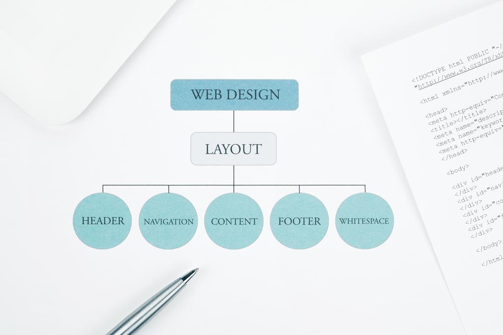
The Fundamental Difference
Here's the simple truth that took me too long to understand: Flexbox is for one-dimensional layouts, CSS Grid is for two-dimensional layouts. That's it. That's the fundamental distinction you need to remember.
Flexbox excels when you're arranging items in a row OR a column. Navigation bars, card rows, button groups, form fields – these are Flexbox territory. You're dealing with a single axis at a time.
CSS Grid shines when you need rows AND columns simultaneously. Page layouts, image galleries, dashboards, complex card arrangements – that's Grid's domain. You're defining a complete two-dimensional structure.
Understanding Flexbox's Strength
Let me show you where Flexbox really shines. Say you have a navigation bar with items that need to be evenly spaced:
.nav {
    display: flex;
    justify-content: space-between;
    align-items: center;
    padding: 1rem;
}
Three lines of CSS, and your navigation is perfectly laid out. Items automatically adjust to content size, they're vertically centered, and they space themselves evenly. Try doing that with floats or inline-block – you'll write three times the code and still have alignment issues.
Flexbox also handles content reflow beautifully. Add flex-wrap: wrap, and your items automatically move to new rows when space runs out. No media queries needed for basic responsiveness.
Flexbox for Component Layouts
I use Flexbox constantly for component-level layouts:
- Card components: Flexbox naturally handles header, content, and footer sections with proper spacing
- Form groups: Label-input pairs align perfectly with minimal code
- Button groups: Multiple buttons space evenly with gap property
- Media objects: Image on one side, text on the other – classic Flexbox use case
- Navigation menus: Horizontal or vertical, Flexbox handles both elegantly
Here's a practical example – a card component with flexible content:
.card {
    display: flex;
    flex-direction: column;
    height: 100%;
}

.card-header {
    /* Fixed height */
}

.card-body {
    flex: 1; /* Takes remaining space */
}

.card-footer {
    /* Fixed height */
}
The body section grows to fill available space, ensuring cards of different heights align properly. This is Flexbox at its best – dynamic, flexible, responsive.

CSS Grid: The Power Player
Now let's talk Grid. Here's a classic layout – header, sidebar, main content, and footer:
.container {
    display: grid;
    grid-template-areas:
        "header header"
        "sidebar main"
        "footer footer";
    grid-template-columns: 250px 1fr;
    grid-template-rows: auto 1fr auto;
    min-height: 100vh;
    gap: 20px;
}
Look at that. A complete page layout in a few lines, and it's completely semantic. You can see the structure just by reading the code. The named grid areas make it self-documenting.
With Flexbox, you'd need nested containers, explicit height management, wrapper divs, and probably some JavaScript for equal heights. Grid does it all declaratively.
Grid's Two-Dimensional Control
Grid gives you simultaneous control over both dimensions. This is crucial for complex layouts:
.gallery {
    display: grid;
    grid-template-columns: repeat(auto-fit, minmax(250px, 1fr));
    grid-auto-rows: 200px;
    gap: 1rem;
}

.gallery-item--large {
    grid-column: span 2;
    grid-row: span 2;
}
This creates a responsive image gallery where items automatically wrap based on available space. Some items span multiple columns and rows. Try doing this with Flexbox – you'll end up with nested containers and hacky calculations.

When to Choose Each
After years of using both, here's my decision framework:
Use Flexbox When:
- Laying out items in a single direction (row or column)
- Content size should determine layout (content-first approach)
- You need to distribute space between items dynamically
- Building component-level layouts (cards, forms, navigation)
- Alignment is your primary concern
- You want items to wrap automatically based on container size
Practical examples: navigation menus and toolbars, card components where content determines size, form layouts with label-input pairs, button groups and action bars, any time you're thinking "I need these things in a row" or "I need these things in a column."
Use Grid When:
- Defining a two-dimensional layout structure
- Layout should control content placement (layout-first approach)
- You need precise control over both rows and columns
- Building page-level layouts
- Working with overlapping content
- You want explicit control over item placement
Practical examples: page layouts with distinct regions (header, sidebar, content, footer), image galleries with consistent grid structure, data tables or card grids needing alignment in both directions, magazine-style layouts with varying content positions, dashboard layouts with multiple panels, any time you're thinking "I need to define areas on both axes."
They Work Together
Here's something that took me too long to realize: you don't choose between Grid and Flexbox. You use both in the same project. In fact, you probably should.
Use Grid for your main page structure, then use Flexbox for the content inside those grid areas. This is the pattern I follow in every project now.
Real-World Combination Example
Consider a typical web application:
/* Page structure: Grid */
.app-layout {
    display: grid;
    grid-template-areas:
        "header header"
        "sidebar main"
        "footer footer";
    grid-template-columns: 250px 1fr;
    grid-template-rows: 60px 1fr 40px;
}

/* Header content: Flexbox */
.header {
    display: flex;
    justify-content: space-between;
    align-items: center;
}

/* Sidebar navigation: Flexbox */
.sidebar-nav {
    display: flex;
    flex-direction: column;
    gap: 0.5rem;
}

/* Main content cards: Grid */
.card-grid {
    display: grid;
    grid-template-columns: repeat(auto-fit, minmax(300px, 1fr));
    gap: 2rem;
}

/* Individual card: Flexbox */
.card {
    display: flex;
    flex-direction: column;
}
See the pattern? Grid defines the overall structure. Flexbox handles the components within that structure. Grid for macro layout, Flexbox for micro layout.
Browser Support and Performance
Both Flexbox and Grid have excellent browser support now. As of 2025, over 98% of users have browsers that fully support both. If you're still worried about IE11... it's time to let it go.
Performance-wise, both are highly optimized by modern browsers. Grid isn't slower than Flexbox, and Flexbox isn't slower than Grid. They're implemented at the browser engine level and are faster than any JavaScript-based layout solution.
Progressive Enhancement
If you absolutely must support ancient browsers, use feature queries:
/* Fallback for old browsers */
.container {
    display: block;
}

/* Modern browsers get Grid */
@supports (display: grid) {
    .container {
        display: grid;
        grid-template-columns: repeat(3, 1fr);
    }
}
But honestly, in 2025, this is rarely necessary. Focus on building great experiences for modern browsers.
Common Mistakes and Misconceptions
Let me address the mistakes I see developers make:
Mistake #1: Using Grid for Everything
Just because Grid is powerful doesn't mean you should use it everywhere. A simple horizontal navigation? That's Flexbox. Don't overcomplicate things.
Mistake #2: Not Learning Grid Because "Flexbox is Enough"
Flexbox is great, but it's not a complete layout solution. You'll hit its limitations quickly when building complex layouts. Learn Grid – it's not as hard as it looks.
Mistake #3: Forgetting About Subgrid
Subgrid (now supported in all modern browsers) lets nested grids align with parent grid tracks. This solves common alignment issues in complex layouts.
Mistake #4: Overusing Nested Flex Containers
If you find yourself nesting three or four Flexbox containers to achieve a layout, stop. You probably need Grid instead.
Learning Resources and Next Steps
Want to master both? Here's my recommended path:
- Learn Flexbox first – it's simpler and you'll use it constantly
- Understand the flex properties: flex-grow, flex-shrink, flex-basis
- Move to Grid when you hit Flexbox's limitations
- Practice Grid with real layouts, not just tutorials
- Learn to combine both in the same project
The learning curve for Grid might seem steeper initially, but it's worth it. Once you understand grid-template-areas and the fr unit, you'll build layouts faster than you ever did with Flexbox hacks or float-based layouts.
The Bottom Line
Stop trying to make Flexbox do Grid's job, and stop overcomplicating simple layouts with Grid when Flexbox would suffice. Learn both, understand their strengths, and use the right tool for each situation.
Your CSS will be cleaner, more maintainable, and actually make sense when you revisit it six months later. More importantly, you'll spend less time fighting your layout and more time building features.
Both Flexbox and Grid are gifts to frontend developers. Use them wisely, and your layouts will thank you.