For years, web layouts meant floats, clearfix hacks, and fighting with CSS positioning. Then CSS Grid arrived and changed everything. It's not just another layout tool - it's a complete paradigm shift in how we think about web design.
I remember the first time I truly understood Grid. I was building a dashboard with a complex layout that would have taken hundreds of lines of positioning hacks. With Grid, it took 20 lines and just worked. That's when I realized Grid wasn't just better - it was fundamentally different.

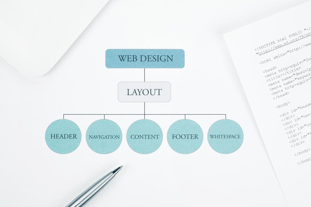
Understanding the Grid Mental Model
Grid is a two-dimensional layout system. Unlike Flexbox, which is one-dimensional (either row or column), Grid lets you control both rows and columns simultaneously. This is the key insight that makes everything else make sense.
Think of Grid as drawing lines on paper to create boxes, then placing content in those boxes. You define the grid structure, then place items into it.
Creating Your First Grid
The basic setup is simple:
.container {
  display: grid;
  grid-template-columns: 200px 1fr 1fr;
  grid-template-rows: auto 1fr auto;
  gap: 20px;
}
This creates a 3-column, 3-row grid. The first column is fixed at 200px. The other two columns split the remaining space equally using fr units (fractional units). Rows are sized automatically based on content, except the middle row which takes all available space.
The gap property adds space between grid items. No more margin hacks to create spacing.
The Power of FR Units
Fractional units (fr) are Grid's secret weapon. They represent a fraction of available space:
grid-template-columns: 1fr 2fr 1fr;This creates three columns where the middle one is twice as wide as the others. The calculation is automatic and responsive. No percentages, no calc(), just intuitive fractional divisions.

Practical Layout Patterns
Let's look at real-world layouts you'll actually build.
The Holy Grail Layout
Header, footer, sidebar, main content - the classic web layout that used to require tables or complex floats:
.container {
  display: grid;
  grid-template-columns: 200px 1fr;
  grid-template-rows: auto 1fr auto;
  grid-template-areas:
    "header header"
    "sidebar main"
    "footer footer";
  min-height: 100vh;
}

.header { grid-area: header; }
.sidebar { grid-area: sidebar; }
.main { grid-area: main; }
.footer { grid-area: footer; }
Named grid areas make the layout self-documenting. You can see the structure just by reading the grid-template-areas. And it's responsive - just change the template on smaller screens:
@media (max-width: 768px) {
  .container {
    grid-template-columns: 1fr;
    grid-template-areas:
      "header"
      "main"
      "sidebar"
      "footer";
  }
}
Responsive Card Grid
The auto-fill and auto-fit keywords create responsive grids without media queries:
.grid {
  display: grid;
  grid-template-columns: repeat(auto-fit, minmax(250px, 1fr));
  gap: 20px;
}
This creates as many columns as fit in the available space, with each column at least 250px wide. As the viewport shrinks, columns automatically wrap. No JavaScript, no media queries needed.
The difference between auto-fit and auto-fill: auto-fit collapses empty tracks, auto-fill keeps them. Use auto-fit for most cases.
Complex Dashboard Layout
Grid really shines with complex layouts:
.dashboard {
  display: grid;
  grid-template-columns: repeat(4, 1fr);
  grid-template-rows: repeat(3, minmax(150px, auto));
  gap: 15px;
}

.widget-large {
  grid-column: span 2;
  grid-row: span 2;
}

.widget-tall {
  grid-row: span 2;
}

.widget-wide {
  grid-column: span 2;
}
Items can span multiple columns or rows. The layout adapts automatically. No absolute positioning, no z-index wars, just clean declarative CSS.

Advanced Grid Techniques
Once you understand the basics, these advanced features unlock even more power.
Grid Line Placement
You can place items precisely using grid lines:
.item {
  grid-column: 1 / 3;  /* Start at line 1, end at line 3 */
  grid-row: 2 / 4;     /* Start at line 2, end at line 4 */
}

/* Or use span */
.item {
  grid-column: 1 / span 2;  /* Start at line 1, span 2 tracks */
  grid-row: 2 / span 2;
}
Grid lines are numbered starting from 1. You can also use negative numbers to count from the end: -1 is the last line, -2 is second-to-last, etc.
Implicit vs Explicit Grids
The explicit grid is what you define with grid-template-columns and grid-template-rows. But if you place items outside this grid, the implicit grid kicks in:
.container {
  display: grid;
  grid-template-columns: repeat(3, 1fr);
  grid-auto-rows: 100px;  /* Size for implicit rows */
  grid-auto-flow: dense;  /* Fill gaps automatically */
}
The dense packing algorithm fills in gaps in your grid. Perfect for masonry-style layouts where items have different sizes.
Nested Grids
Grid items can themselves be grids. This creates incredibly flexible layouts:
.card {
  display: grid;
  grid-template-rows: auto 1fr auto;
  gap: 10px;
}

.card-image { /* row 1 */ }
.card-content { /* row 2 */ }
.card-actions { /* row 3 */ }
Each card has its own internal grid layout. This is how you build complex components with predictable, maintainable structure.
Aligning and Justifying Content
Grid gives you precise control over alignment in both dimensions.
Container-Level Alignment
.container {
  display: grid;
  justify-items: start;    /* Align items horizontally */
  align-items: start;      /* Align items vertically */
  justify-content: center; /* Align grid horizontally */
  align-content: center;   /* Align grid vertically */
}
Remember the difference:
- justify-*: Controls horizontal alignment
- align-*: Controls vertical alignment
- *-items: Aligns items within their grid areas
- *-content: Aligns the entire grid within the container
Item-Level Alignment
Individual items can override container alignment:
.item {
  justify-self: end;  /* This item aligns to the right */
  align-self: center; /* This item centers vertically */
}
This is perfect for special cases like placing an icon in the corner of a grid cell.
Grid vs Flexbox: When to Use Which
I get this question constantly. The answer: use both, they're complementary.
Use Grid When:
- You need two-dimensional layouts (controlling both rows and columns)
- You're designing the overall page structure
- You know the layout structure ahead of time
- You need precise control over item placement
- You want responsive layouts without media queries
Use Flexbox When:
- You need one-dimensional layouts (either row or column)
- You're aligning items within a component
- Content should determine layout (content-out approach)
- You need to distribute space between items
- You're working with navigation bars, button groups, or form layouts
In practice, I use Grid for page layout and major sections, Flexbox for component internals. A grid item often contains a flexbox layout.
Browser Support and Fallbacks
CSS Grid has excellent browser support now - over 95% of users. But if you need to support older browsers:
/* Flexbox fallback */
.container {
  display: flex;
  flex-wrap: wrap;
}

/* Grid for modern browsers */
@supports (display: grid) {
  .container {
    display: grid;
    grid-template-columns: repeat(auto-fit, minmax(250px, 1fr));
  }
}
Feature queries (@supports) let you progressively enhance. Old browsers get a working flexbox layout, modern browsers get the superior grid layout.
Common Grid Pitfalls
Avoid these mistakes I see all the time:
- Over-engineering: Don't use Grid for everything. A simple flexbox row is often better than a single-row grid.
- Forgetting min-width: Items can overflow their grid areas if content is too wide. Use
minmax()or setmin-width: 0on items. - Not using named areas: Named areas make complex layouts readable. Use them for anything more complex than a simple grid.
- Ignoring implicit grid: Understand how implicit grid works or you'll get unexpected layouts.
- Fighting the algorithm: Grid is declarative. Trust the algorithm instead of trying to micromanage every pixel.
Real-World Example: Magazine Layout
Let's build something practical - a magazine-style article layout:
.article {
  display: grid;
  grid-template-columns: 1fr min(65ch, 100%) 1fr;
  gap: 20px;
}

.article > * {
  grid-column: 2; /* All content in center column */
}

.article-image-full {
  grid-column: 1 / -1; /* Full width */
}

.article-image-bleed {
  grid-column: 2 / -1; /* Bleeds to the right */
}
This creates a centered content column with controlled line length (65 characters) for readability, but allows images to break out to full width or bleed to one side. It's the kind of layout that was nearly impossible before Grid.
Debugging Grid Layouts
Modern browser DevTools have excellent Grid inspection:
- Firefox: Best Grid inspector - shows line numbers, area names, and gaps
- Chrome: Good Grid overlay with line numbers and area highlighting
- Safari: Basic Grid inspection with visual overlay
Enable the Grid overlay in DevTools to see the actual grid lines and areas. It makes debugging layout issues trivial.
The Future of Grid
CSS Grid is actively evolving. Features coming soon or recently added:
- Subgrid: Lets nested grids align with parent grid (already in Firefox and Safari)
- Masonry layout: Native Pinterest-style layouts without JavaScript
- Container queries: Responsive design based on container size, not viewport
Grid has fundamentally changed how we build for the web. It's not a hack or a workaround - it's a proper layout system designed for modern web design. Learn it well, and you'll wonder how you ever built websites without it.