Your portfolio needs photos. Product shots, workspace setups, project documentation – good photos make everything look more professional and credible. I'm not a photographer, but after years of documenting projects for my portfolio and blog, I learned enough to take decent photos that don't look amateurish. Here's what actually matters, and what doesn't.
The good news: you don't need expensive equipment or years of training. You need to understand a few fundamental principles and practice applying them. Most of what makes a photo look "professional" comes down to attention to detail, not camera quality.
Lighting: The Only Thing That Really Matters
Forget expensive cameras and lenses. Lighting is 90% of photography, maybe more. I consistently take better photos with my phone near a window than with a DSLR under harsh overhead fluorescent lights. Light quality matters infinitely more than camera quality.
Natural Light Is Your Best Friend
Natural light from a window is the secret weapon of good photography. Position your subject near a large window, but not in direct sunlight. Direct sun creates harsh shadows and blown-out highlights. Diffused light from a cloudy day or a shaded north-facing window is perfect – soft, even, flattering.
Window light characteristics:
- Soft and directional: Creates gentle shadows that add dimension
- Free and available: Works during the day in any room with windows
- Easy to modify: Use curtains or blinds to diffuse harsh direct sunlight
- Natural color: No weird color casts from artificial lights
Set up your workspace or project near a window. Shoot perpendicular to the window – subject beside it, not facing or away from it. This creates pleasing side lighting with natural falloff.
Time of Day Matters
Not all daylight is equal:
- Early morning (1-2 hours after sunrise): Warm, soft, directional light. Great for outdoor shots
- Midday (10am-3pm): Harsh, overhead light. Avoid shooting outside. Good for window light indoors though
- Late afternoon/Golden hour (1-2 hours before sunset): Warm, magical light. Perfect for any photography
- Blue hour (just after sunset): Cool, ethereal light. Great for tech projects with screens
- Overcast days: Giant natural softbox. Incredibly flattering light all day
If I'm shooting outdoors, I only shoot during golden hour or on overcast days. Harsh midday sun ruins photos.
Artificial Light: When You Must
Sometimes natural light isn't available. If you must use artificial light:
- Avoid direct flash: Creates harsh shadows and unflattering highlights
- Use desk lamps: Position two lamps at 45-degree angles from your subject
- Bounce light: Point lamps at white walls or ceilings to diffuse
- Mix with natural: Combine window light with a lamp to fill shadows
- LED panels: If you're serious, a $30 LED panel gives you control
But honestly? Just shoot near a window during the day. It's easier and looks better.
Composition: The Rule of Thirds
Enable your camera's grid overlay (every phone camera has this in settings). This grid divides your frame into nine equal parts with two horizontal and two vertical lines. This is called the rule of thirds.
How to Use It
Place your subject along these lines or at their intersections, not dead center. This creates visual interest and balance.
- Horizontal elements (like horizons or desk edges) along horizontal lines
- Vertical elements (like standing objects or screen edges) along vertical lines
- Key focal points (like a mouse cursor or product logo) at line intersections
- Eyes or important features at the upper intersection points
Why does this work? Centered subjects can look static and boring. Off-center placement creates dynamic tension. Your eye naturally follows the lines and rests at the intersections. It just looks more interesting.
Practical Application for Project Docs
For documenting code projects:
- Don't center your laptop in every shot – Place it along the right third line
- Show context on the left – Coffee mug, notebook, pen, phone
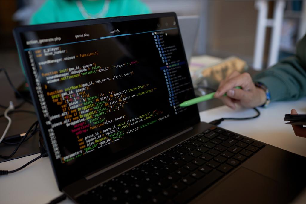
- Include your hands sometimes – Shows the work is yours, adds human element
- Let the screen content be prominent – Position code or UI at an intersection
- Leave breathing room – Don't fill every pixel, let the frame breathe
You're telling a story, not just showing "here's my computer." Context makes photos more engaging.
Breaking the Rule
Once you understand the rule of thirds, you can break it intentionally. Centered compositions work for:
- Symmetrical subjects (architecture, patterns)
- Minimalist compositions (single object on plain background)
- Direct, confrontational images (product shots)
But learn the rule first before breaking it. Broken rules look intentional. Ignored rules look amateur.
Background: Keep It Clean and Intentional
Nothing ruins a good project photo faster than a messy or distracting background. That pile of cables, dirty dishes, unmade bed in the background, random sticky notes – they all draw attention away from your subject.
The Five-Second Scan
Before pressing the shutter, scan your entire frame for five seconds:
- Look at the edges: What's creeping into the frame?
- Check behind the subject: Any distracting objects?
- Scan for bright spots: Bright areas draw the eye
- Look for lines: Do any lines cut through awkwardly?
- Check for text: Unintentional text in frame is distracting
Move distracting items out of frame. Straighten things up. Close that 47-tab browser. A plain wall, clean desk, or simple surface makes your subject pop. Busy backgrounds make everything look cluttered and unprofessional.
Background Choices
Good background options for project documentation:
- White wall: Classic, clean, makes colors pop
- Wooden desk: Warm, professional, technical aesthetic
- Concrete or neutral surface: Modern, minimalist look
- Bookshelf (out of focus): Adds context, shows personality
- Plants: Add life and color without being distracting
- Solid color backdrop: Control the entire aesthetic
Backgrounds to avoid:
- Messy rooms with visible clutter
- Bathrooms (even clean ones look weird)
- Busy patterns (stripes, prints, loud wallpaper)
- Other people or faces in the background
- Windows showing overexposed bright sky
- Multiple competing focal points
Depth of Field and Blur
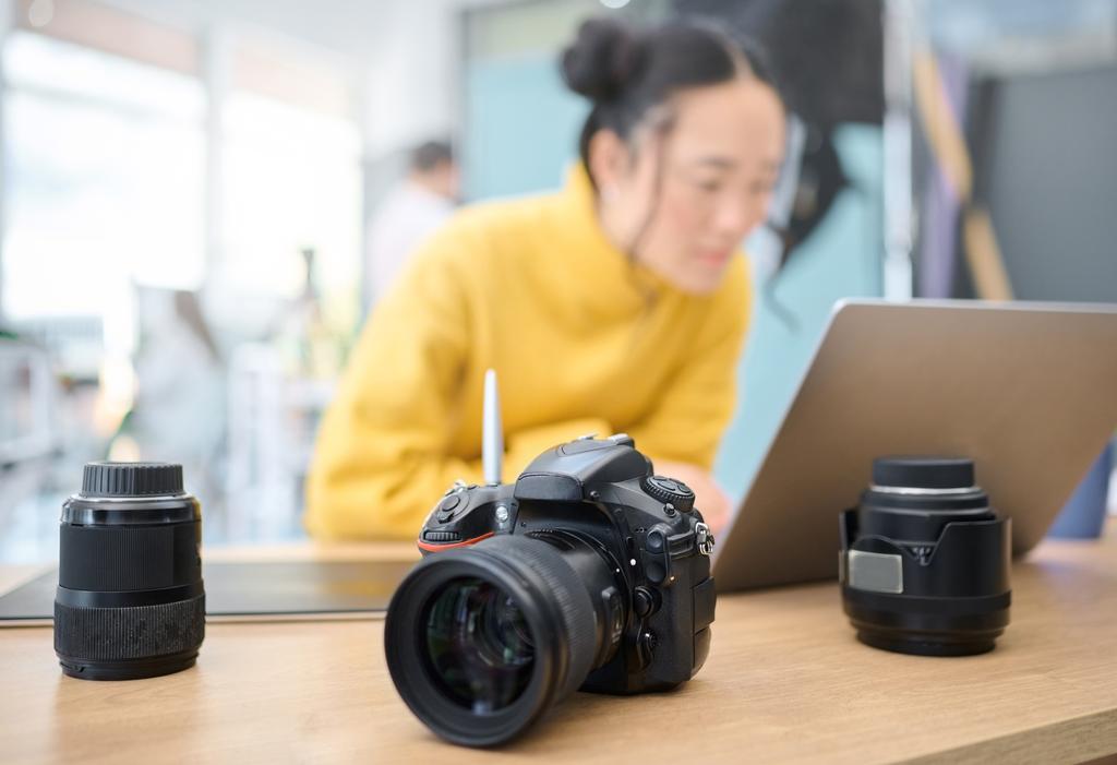
If you can't clean the background, use shallow depth of field to blur it. Most phone cameras now have portrait mode – it artificially blurs the background, making your subject stand out.
For real cameras, use a wide aperture (low f-number like f/1.8 or f/2.8). This blurs everything except what you focus on. The blur (called bokeh) is pleasing and hides background distractions.
Angles: Don't Shoot Everything Head-On
Straight-on, eye-level shots are boring and flat. They're how we see things normally, which makes them uninteresting as photos. Move around. Experiment with different angles.
Angle Options to Try
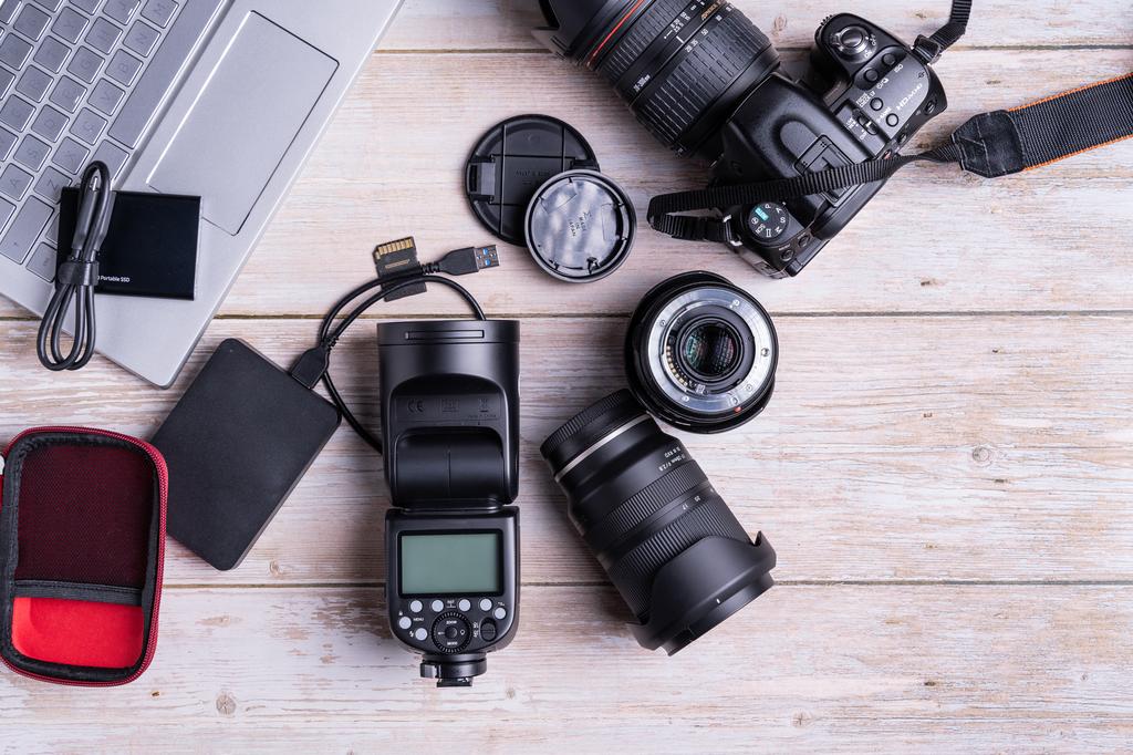
- Flat lay (directly from above): Great for desk setups, workspace organization, product layouts
- 45-degree angle: Most flattering for most objects, shows depth and dimension
- Low angle (below subject): Makes things look impressive, dramatic, important
- Side angle: Shows depth, reveals thickness and layers
- Over-the-shoulder: Good for showing workflow, creates perspective
- Detail shots: Get close, fill the frame with interesting details
Take multiple shots from different angles. You can decide later which works best. Your first instinct angle is rarely your best angle. Move around, try five different perspectives, then review them all.
Practical Examples
For a laptop with code on screen:
- Straight-on at eye level (baseline shot)
- 45-degree from the side (adds dimension)
- Over-the-shoulder (shows your workspace)
- Low angle looking up (makes the setup look impressive)
- Flat lay from above (shows everything on the desk)
- Close-up of just the screen (focuses on the code)
One of these will look significantly better than the others. You won't know which until you try them all.
Editing: Subtle Improvements
You don't need Photoshop or expensive software. Your phone's built-in editor or free apps like Snapseed, Lightroom Mobile, or VSCO work perfectly. The key is subtlety – enhance the photo, don't transform it.
Essential Edits (In Order)
- Straighten the horizon: First thing always. Tilted photos look unprofessional and lazy
- Crop for composition: Improve rule of thirds, remove distractions, change aspect ratio
- Adjust exposure: Brighten slightly if too dark, darken if too bright (subtle changes only)
- Adjust contrast: Increase slightly to make things pop (5-15 points max)
- Adjust highlights and shadows: Recover blown highlights, lift shadows to see detail
- Adjust white balance: Remove color casts, make whites truly white
- Bump saturation: Very slightly increase color intensity (5-10%, absolutely not 50%)
- Sharpen (optional): Add slight sharpness to crisp things up (be very subtle)
What Not to Do
- Don't use preset filters: They often look fake and dated
- Don't over-sharpen: Creates ugly halos and looks artificial
- Don't over-saturate: Colors look unnatural and garish
- Don't use vignettes: Unless you have a very specific reason
- Don't fix terrible photos in editing: Get it right in camera first
The goal is "this looks good and natural" not "this is obviously edited." If someone can tell you edited a photo heavily, you edited too much.
Before and After Comparison
Good editing should be barely noticeable:
Before: Slightly dim, tilted horizon, blue color cast
After: Proper exposure, straight, neutral white balance

Changes made:
- Rotate 0.5° clockwise
- Exposure +0.3
- Contrast +8
- Shadows +15
- Saturation +7
- White balance adjusted to neutral

Result: Looks better but not "edited"
Consistency: Build a Visual Style
Your portfolio or blog photos should look like they belong together. This creates a cohesive visual brand that looks professional and intentional.
How to Build Consistency
- Same lighting setup: Always shoot near the same window or with the same lamp arrangement
- Same backgrounds: White wall, wooden desk, or specific surface for all shots
- Same editing style: Save your editing settings as a preset, apply to all photos
- Same angles: If you use 45-degree angles, use them consistently
- Same props: That coffee mug, that plant, that notebook in multiple shots
My personal style: all project photos shot with natural window light, against white wall or wooden desk, edited with slightly increased brightness (+0.3), mild contrast boost (+10), gentle saturation (+8). Every photo gets the exact same treatment.
The result? My portfolio looks professional and cohesive. People have actually commented on the consistent aesthetic.
Common Mistakes to Avoid
Using Phone Flash
Phone flashes create harsh, unflattering light with hard shadows and weird highlights. They make everything look worse. Turn off the flash. Find better light instead.
Shooting in Poor Light
If the room is too dark, don't shoot there. Find better light. Don't try to fix terrible lighting in editing – you'll just get grainy, noisy, ugly photos. Good lighting is non-negotiable.
Getting Too Close
Leave breathing room around your subject. You can always crop tighter in editing, but you can't uncrop a too-tight shot. When in doubt, back up and include more context.
Ignoring Small Details
These small things matter more than you think:
- Dust on your screen or device
- Fingerprints and smudges
- Visible cables tangled everywhere
- Sticky notes with personal info
- Food crumbs on the desk
- Dirty coffee mug in frame
Clean before you shoot. Spend two minutes making everything look intentional. It shows in the final photo.
Taking Only One Photo
Never take just one photo of something. Take five, ten, twenty from different angles and positions. Professional photographers take hundreds. You can delete the bad ones later.
Not Reviewing Photos Immediately
Check your photos right after shooting, while you're still set up. Is anything out of focus? Is the lighting right? Is composition good? Easier to retake now than realize later you need to reshoot.
Equipment You Actually Need
Here's the truth about equipment for project documentation:
Essential (You Already Have It)
- Your phone: Modern phone cameras are excellent for documentation. iPhone, recent Android, doesn't matter
- Natural light: Free, always available during the day
- Your attention: Most important tool – looking at details, composition, lighting
Worth Getting ($0-$50)
- Phone tripod ($15): Stability and consistent framing. Get one with flexible legs
- White poster board ($3): Reflect light to fill shadows. Can also be a background
- Black poster board ($3): Absorb light to deepen shadows for drama
- Microfiber cloth ($5): Keep screens and devices clean
- Editing app ($0-10): Snapseed is free, Lightroom Mobile is free with limits
Not Worth Getting (Yet)
- DSLR or mirrorless camera ($500-2000): Overkill for project docs unless you know what you're doing
- Expensive lenses ($200-1000): Your phone is fine for now
- Studio lighting ($100-500): Window light works better for most people
- Lightbox for product shots ($50-150): Build one from poster board if needed
I see developers spending hundreds on cameras they don't know how to use, taking worse photos than their phones would capture. Learn composition and lighting with your phone first. Master the basics. If you outgrow your phone – which most of us never do – then consider upgrading.
The Portfolio Photography Workflow
My actual process for documenting projects:
- Clean everything: Wipe screen, organize desk, remove distractions (5 minutes)
- Set up near window: Position project perpendicular to window light
- Enable camera grid: Turn on rule of thirds overlay
- Take many photos: Try 5+ different angles and compositions
- Review immediately: Check focus, exposure, composition
- Retake if needed: Better to shoot more now than need to reshoot later
- Edit consistently: Apply same editing preset to all photos
- Export at right size: Web images don't need to be 20MB
This takes 15-20 minutes total for a full project photoshoot. The result is a set of professional-looking photos that make my work look credible and polished.
The Bottom Line
Good photography for project documentation isn't about expensive equipment or years of training. It's about understanding and applying a few fundamental principles:
- Light matters most: Natural window light beats everything
- Composition matters: Rule of thirds, clean backgrounds, interesting angles
- Details matter: Clean your subject, straighten horizons, remove distractions
- Consistency matters: Build a recognizable style
- Subtlety matters: Edit gently, enhance don't transform
Master these basics with the phone you already have, and your project photos will look professional enough for any portfolio, blog, or documentation. The camera doesn't make the photographer – attention to detail and understanding of fundamentals does.